Analyzing Weather Data from Salzburg Airport: A Comprehensive Guide
In this blog post, we explore a detailed weather data analysis for Salzburg Airport, spanning from 2010 to 2024. The data was retrieved from the Open Meteo Historical Weather API using the following API call:
https://archive-api.open-meteo.com/v1/archive?latitude=47.7933&longitude=13.0043&start_date=2010-01-01&end_date=2024-12-31&daily=temperature_2m_max,temperature_2m_min,temperature_2m_mean,sunrise,sunset,sunshine_duration,rain_sum,snowfall_sum,precipitation_hours,wind_speed_10m_max,wind_direction_10m_dominant&timezone=Europe%2FBerlin
The data includes daily measurements of temperature, sunshine duration, rainfall, snowfall, precipitation hours, and wind speed. You can also view the data and download the CSV from the following link:
Open Meteo Historical Weather API Documentation. Using this data, we leverage powerful Python libraries like pandas and matplotlib to process and visualize the data, providing insights into long-term weather patterns.
Data Processing and Visualizations
The weather data used in this analysis is provided by the Salzburg Airport Weather Station, and the analysis is carried out in a Jupyter Notebook. For every year, we compute and visualize key statistics such as the monthly mean temperature, total rainfall, snowfall sum, and wind speeds. Here’s a breakdown of the key analyses:
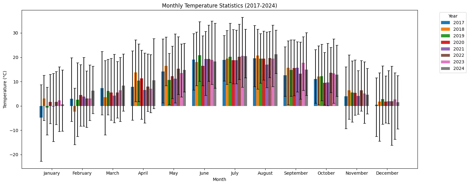
1. Monthly Mean Temperature (°C)
We calculate the mean, maximum, and minimum temperatures for each month from 2010 to 2024, providing a clear picture of how temperatures fluctuate across the years. The visualizations are presented as grouped bar charts, with each group representing a month and bars representing the years. Error bars are used to display the maximum and minimum temperatures for each month.
2. Monthly Mean Sunshine Duration (hours)
Another visualization shows the mean daily sunshine duration for each month, calculated across all years. The chart provides a month-by-month comparison, highlighting the sunshine trends over the years.
3. Monthly Mean Precipitation Hours and Rainfall (mm)
The analysis also covers precipitation hours and total rainfall. We plot the mean precipitation hours for each month alongside the total rainfall sum, offering insights into both the duration and intensity of rainfall events.
4. Monthly Total Snowfall (cm)
We calculate and visualize the total snowfall for each month. This analysis is crucial for understanding seasonal snow patterns, particularly for regions like Salzburg, which experiences significant snowfall during the winter months.
5. Monthly Wind Speed Analysis (km/h)
The wind data is broken down into maximum wind speed at 10 meters, as well as the average wind speed, providing a comprehensive look at how wind patterns change month by month. Visualizations help compare wind speed trends across different years.
Explore the Notebook
All of these analyses are compiled into a Jupyter Notebook, which is available for you to explore. The notebook includes step-by-step instructions for importing the data, processing it, and generating the plots, making it a useful resource for anyone interested in weather data analysis.
You can access the notebook here:
Salzburg Airport Weather Analysis - GitLab
Conclusion
This analysis provides an in-depth look at the weather patterns at Salzburg Airport over a period of 15 years. By leveraging pandas and matplotlib, we are able to gain insights into temperature fluctuations, precipitation trends, snowfall, and wind conditions. This type of weather data analysis is invaluable for various applications, including climate research, aviation forecasting, and seasonal planning.
By using the Jupyter notebook, you can replicate these analyses for your own dataset or modify it for different locations. Enjoy exploring the data and uncovering weather trends!